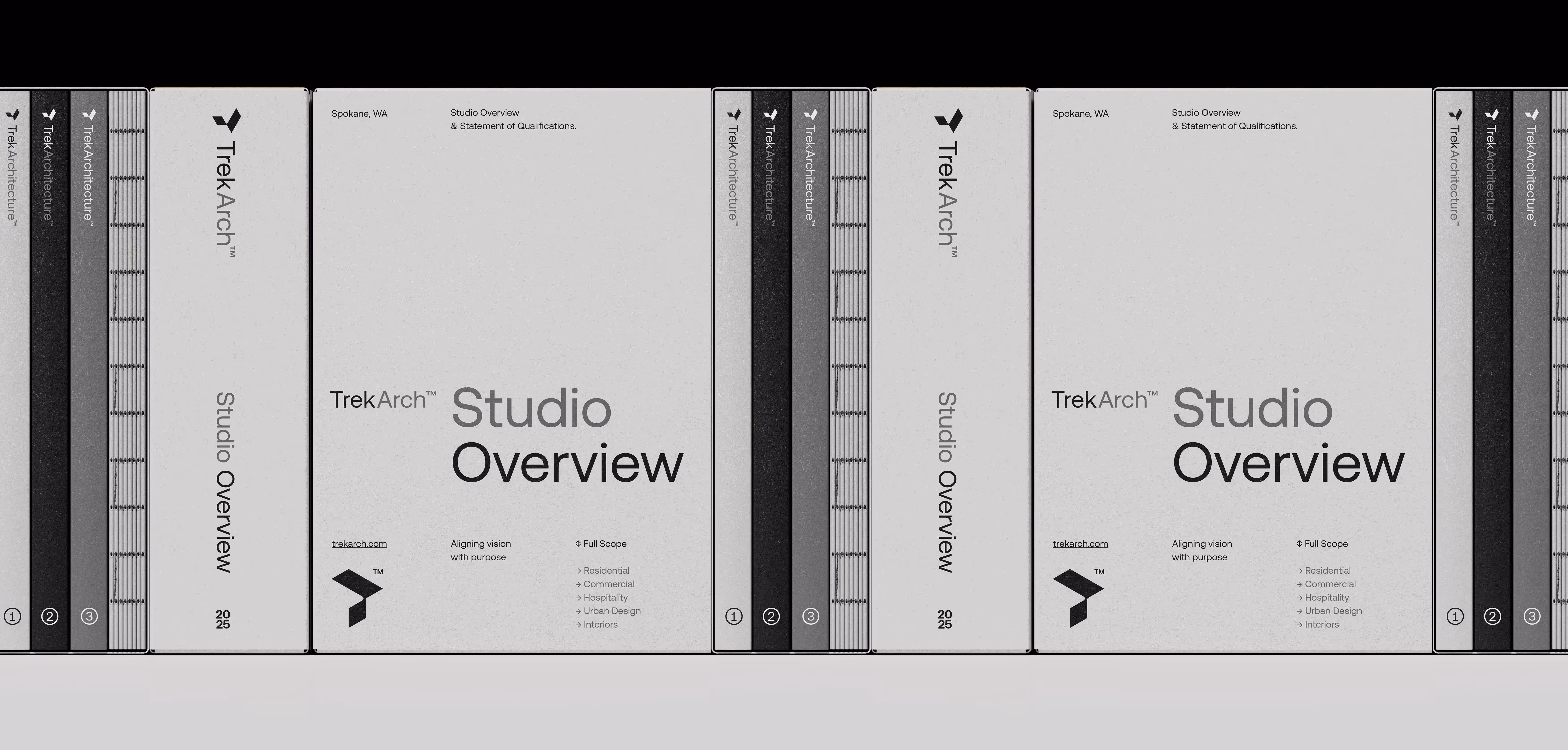
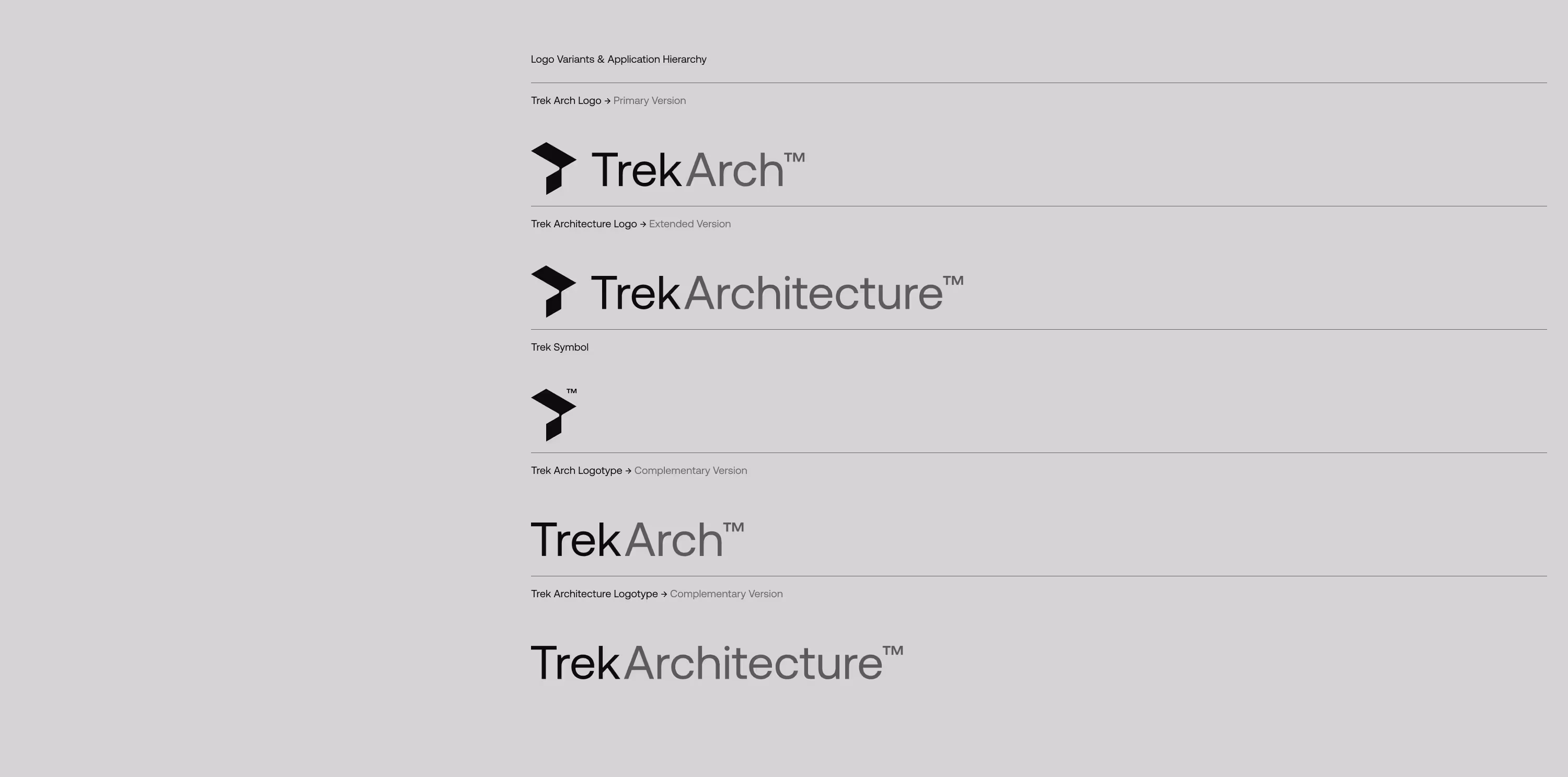
Trek Architecture™
Aligning vision with purpose
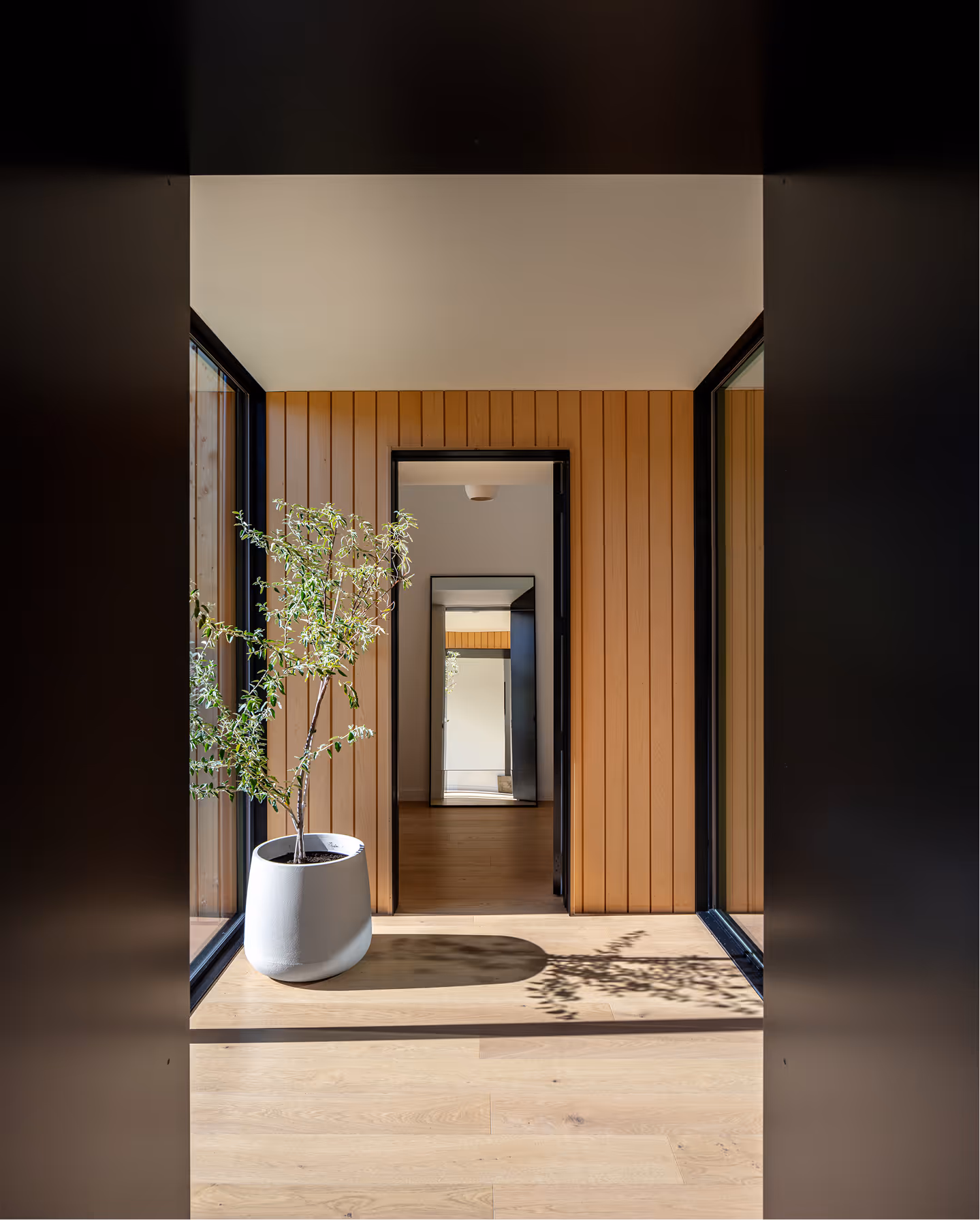
Trek Architecture is an award-winning architecture studio based in the Pacific Northwest. The studio is well-known and respected locally for its quality, technical precision, and client-focused approach.
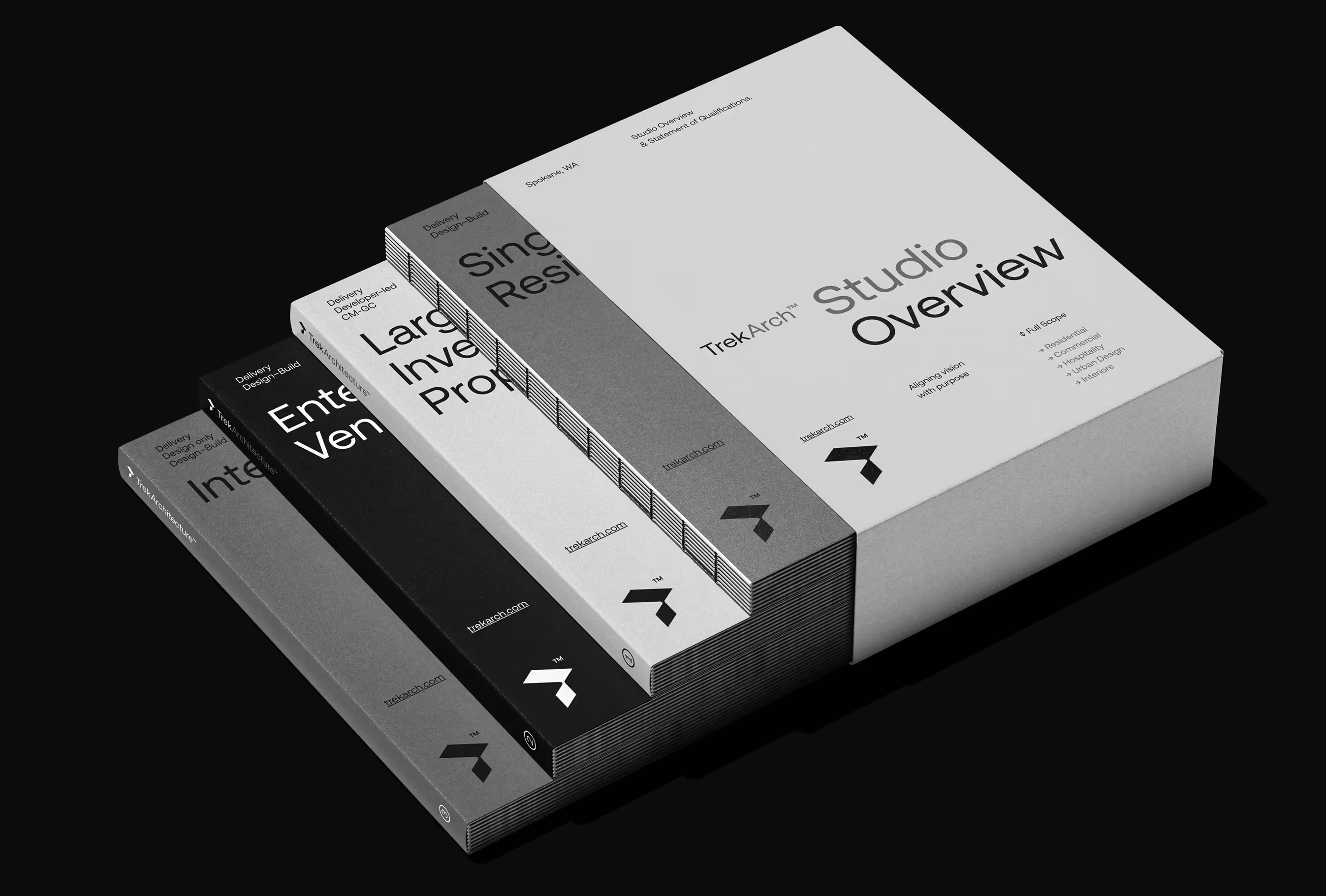
The client approached us for a comprehensive rebrand, including brand strategy, visual identity, website design and implementation.
The main reason for the change was that, while regionally recognized, the brand lacked visibility beyond the local market and had no structured identity system.
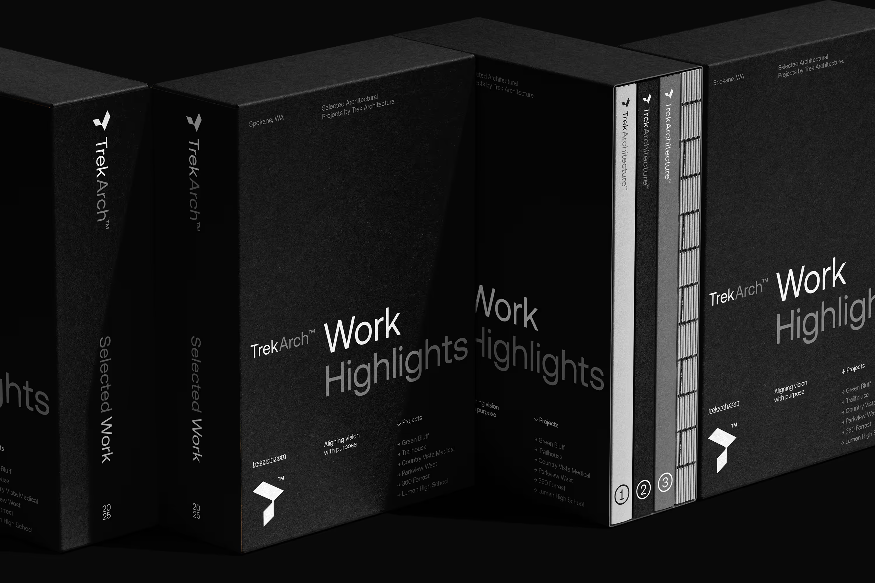
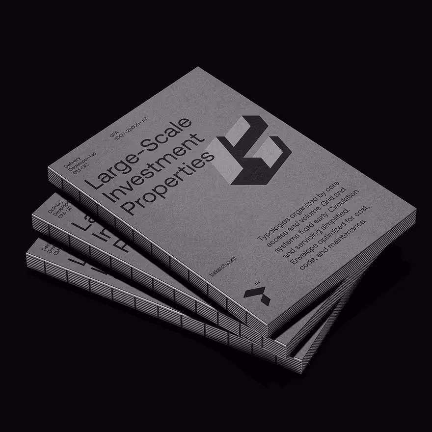
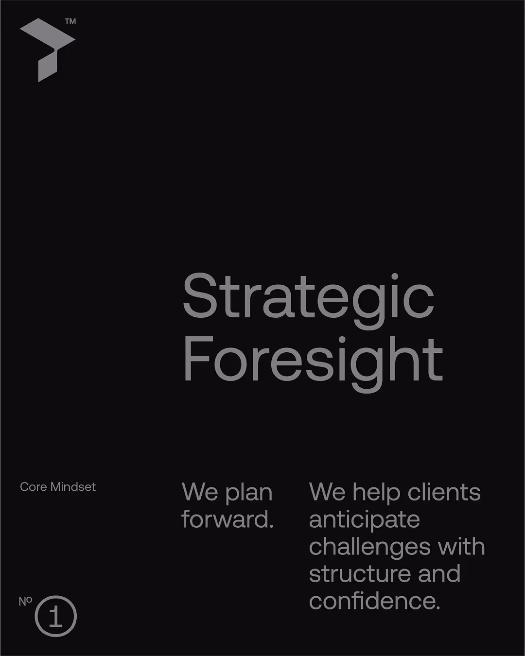
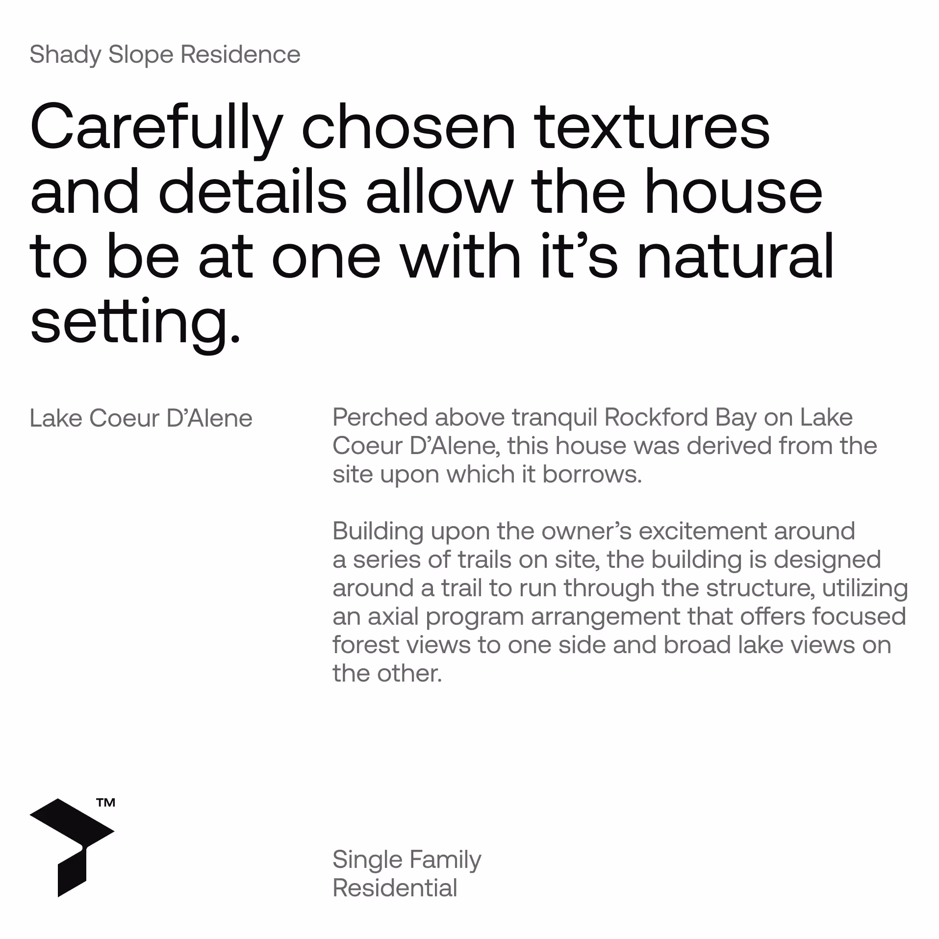
Our task was to create a brand identity that reflects what TrekArch truly is: an established studio with the resources, skills, experience and vision to take on demanding projects.
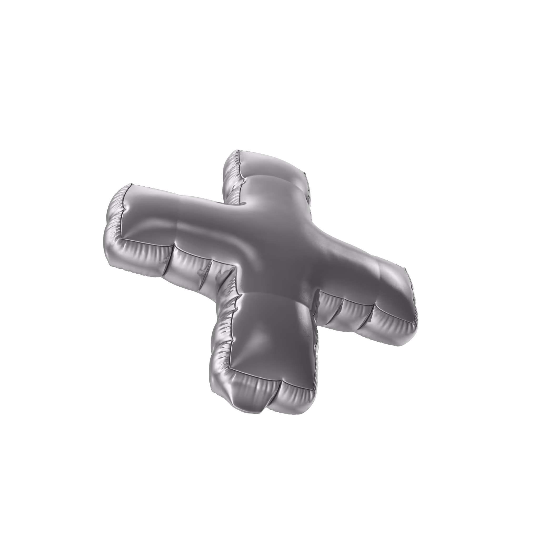
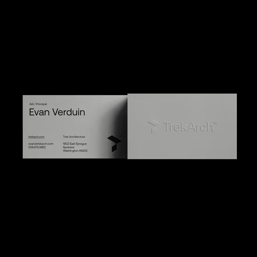
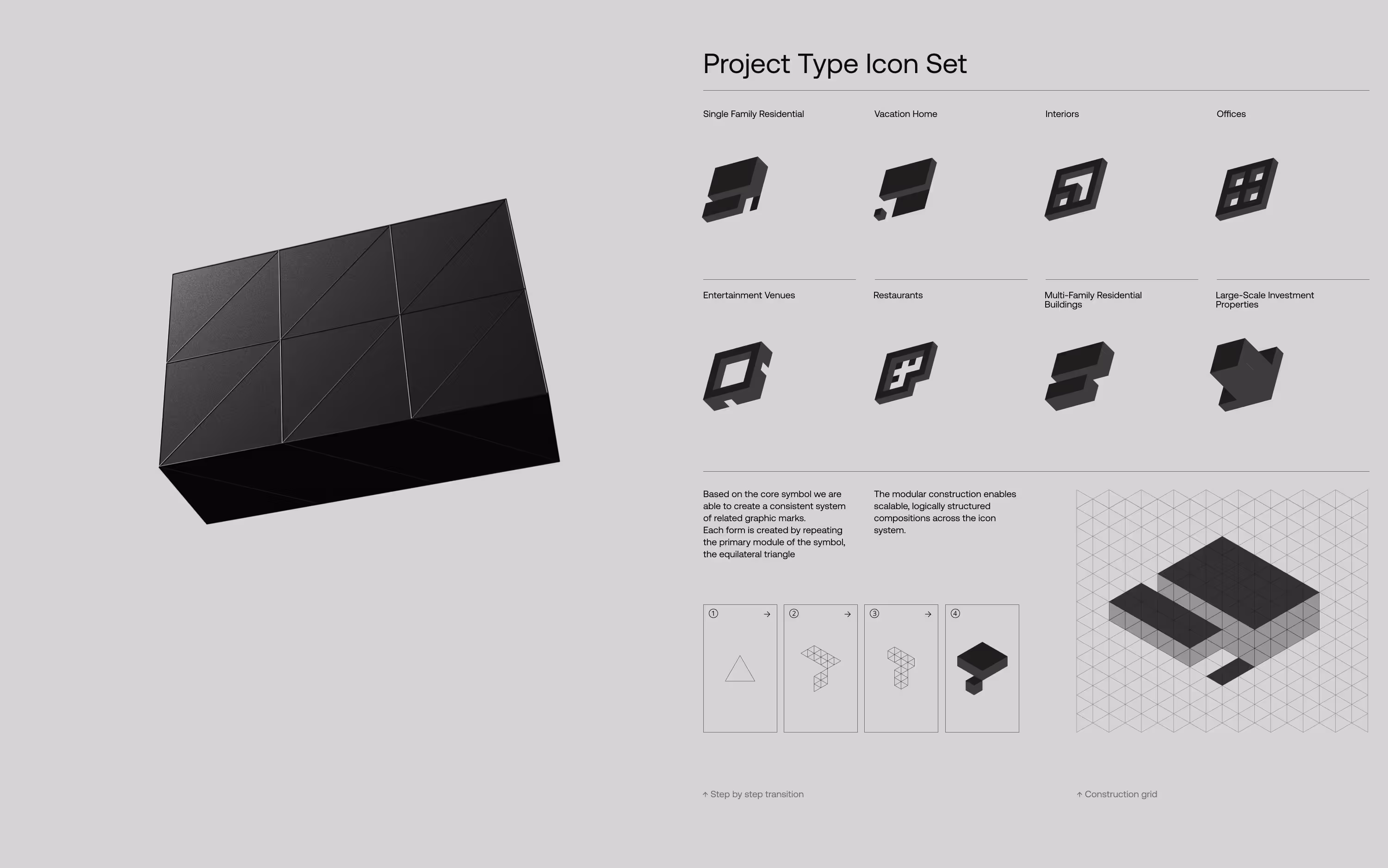
At the same time, we had to preserve the elements that already worked and were recognized in the local market. The core of this was the symbol. Specifically, its concept, the letter T, built from equilateral triangles and shown in perspective.
- Project Information ⮧
- Client
- Location
- Year
- Industry
- Trek Architecture™
- Spokane, United States
- 2025
- Architecture

We kept the concept of equilateral triangles and explored how to use them more effectively and in less conventional ways. The goal was to enhance uniqueness and build a stronger visual presence.
The new form and idea of the Trek symbol opened up multiple possibilities for expanding the visual narrative. It became the foundation for the system.
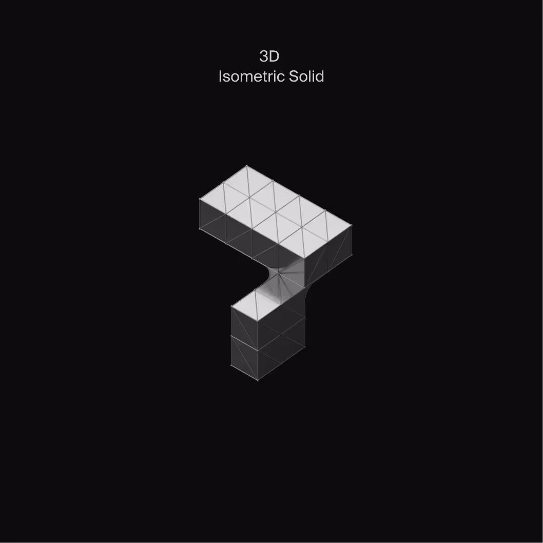
The main change and key feature of the new symbol is its ability to transition seamlessly between 2D and 3D space. It was designed to maintain logic and consistency across both dimensions. These dynamic planes and forms reflect the language of architecture, its vision and precision.
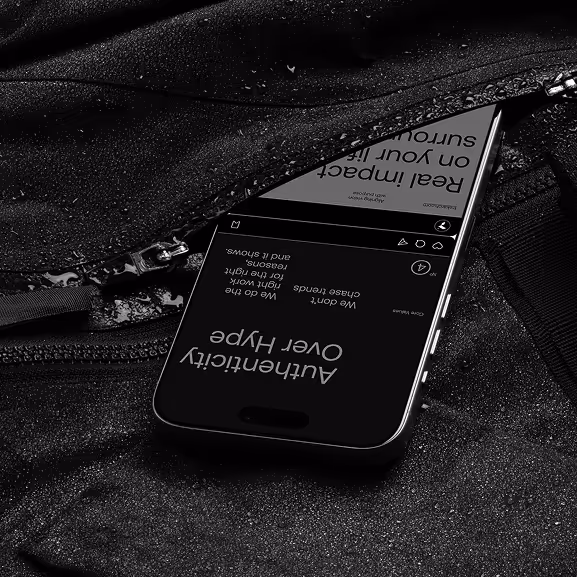
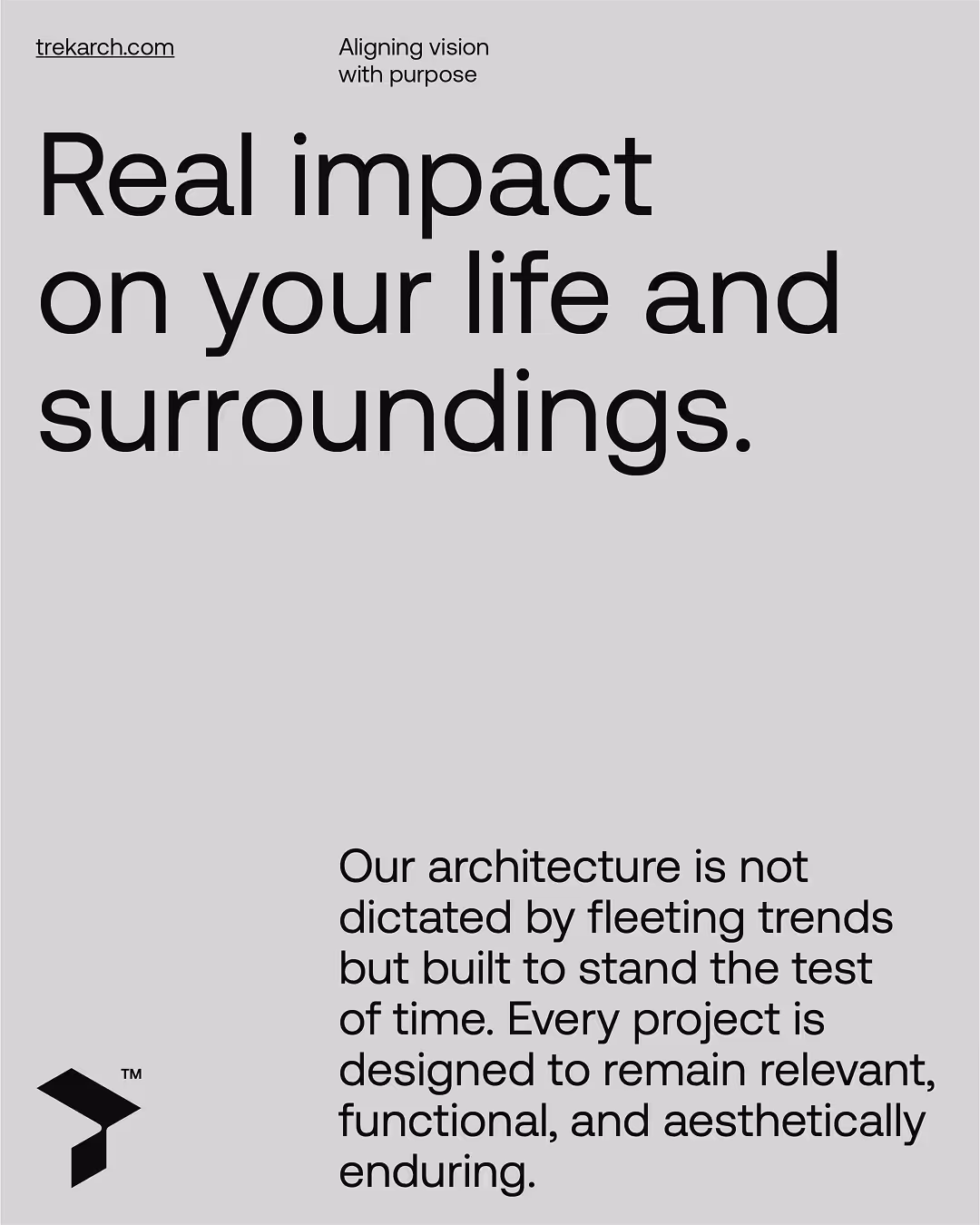
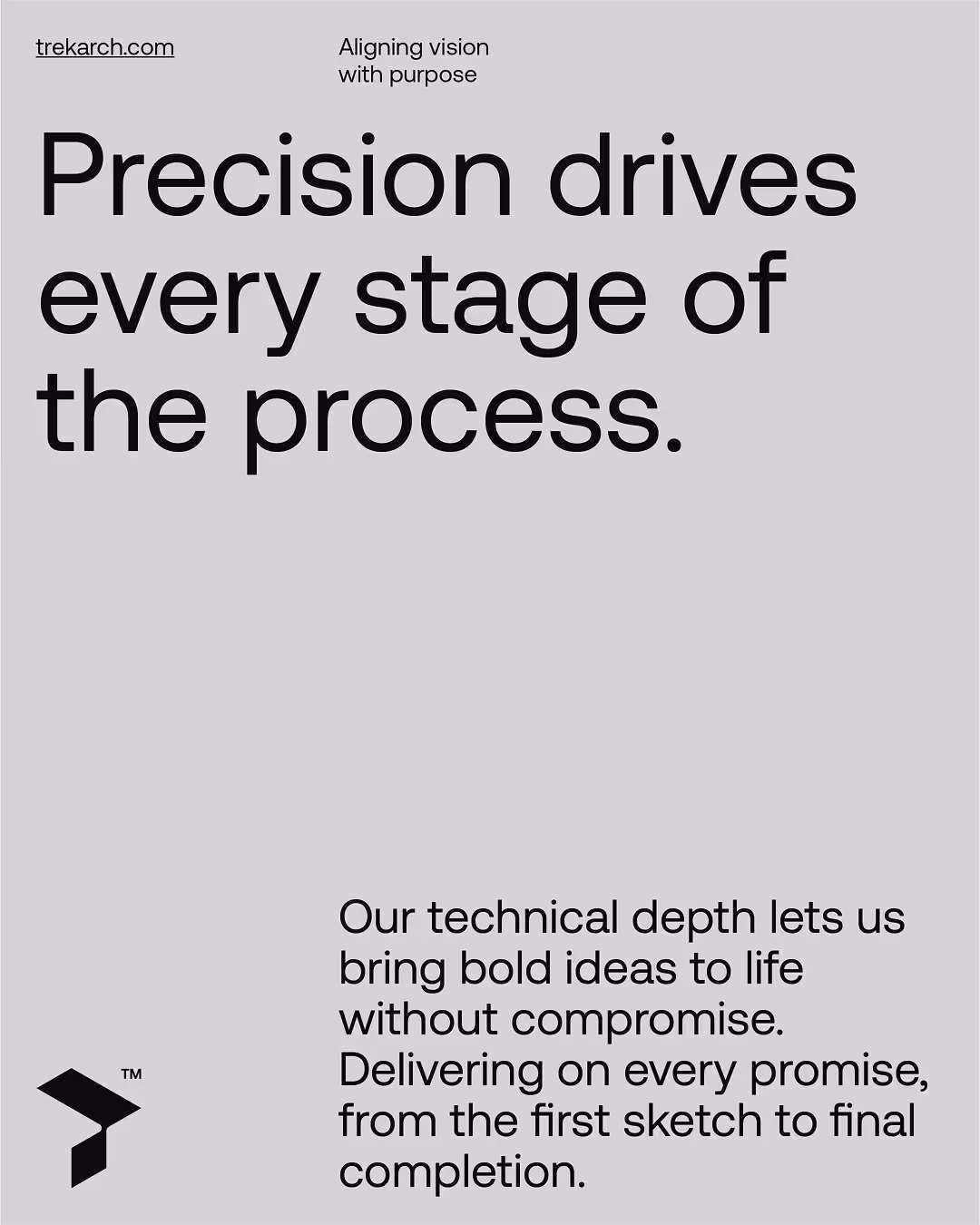
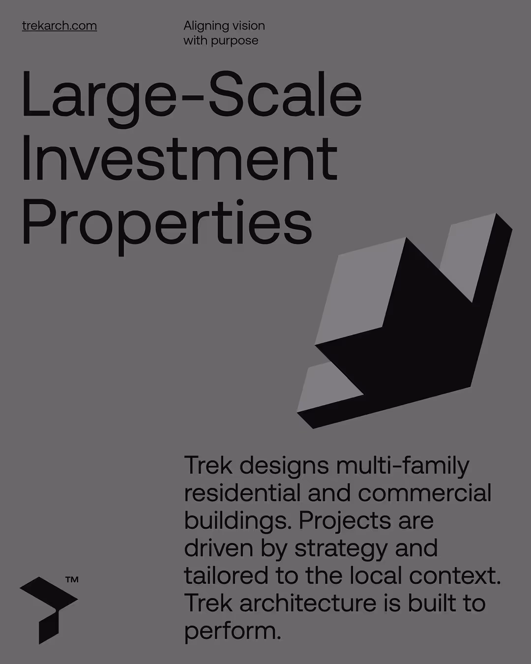
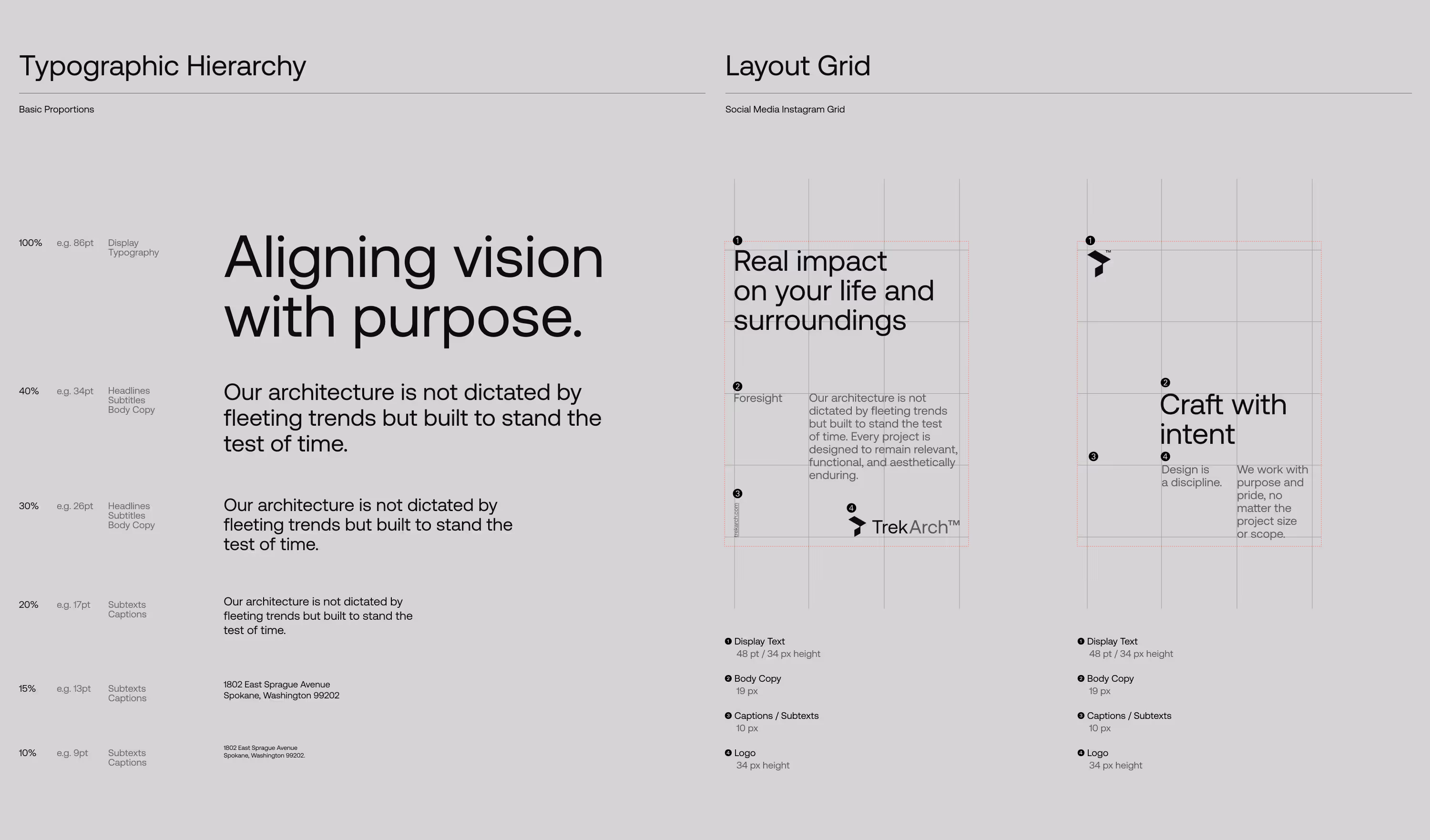
The brand’s visual language is disciplined, clear and confident. It is based on distinctive compositions, built on rigorous typographic grids, which use scale contrast between components.
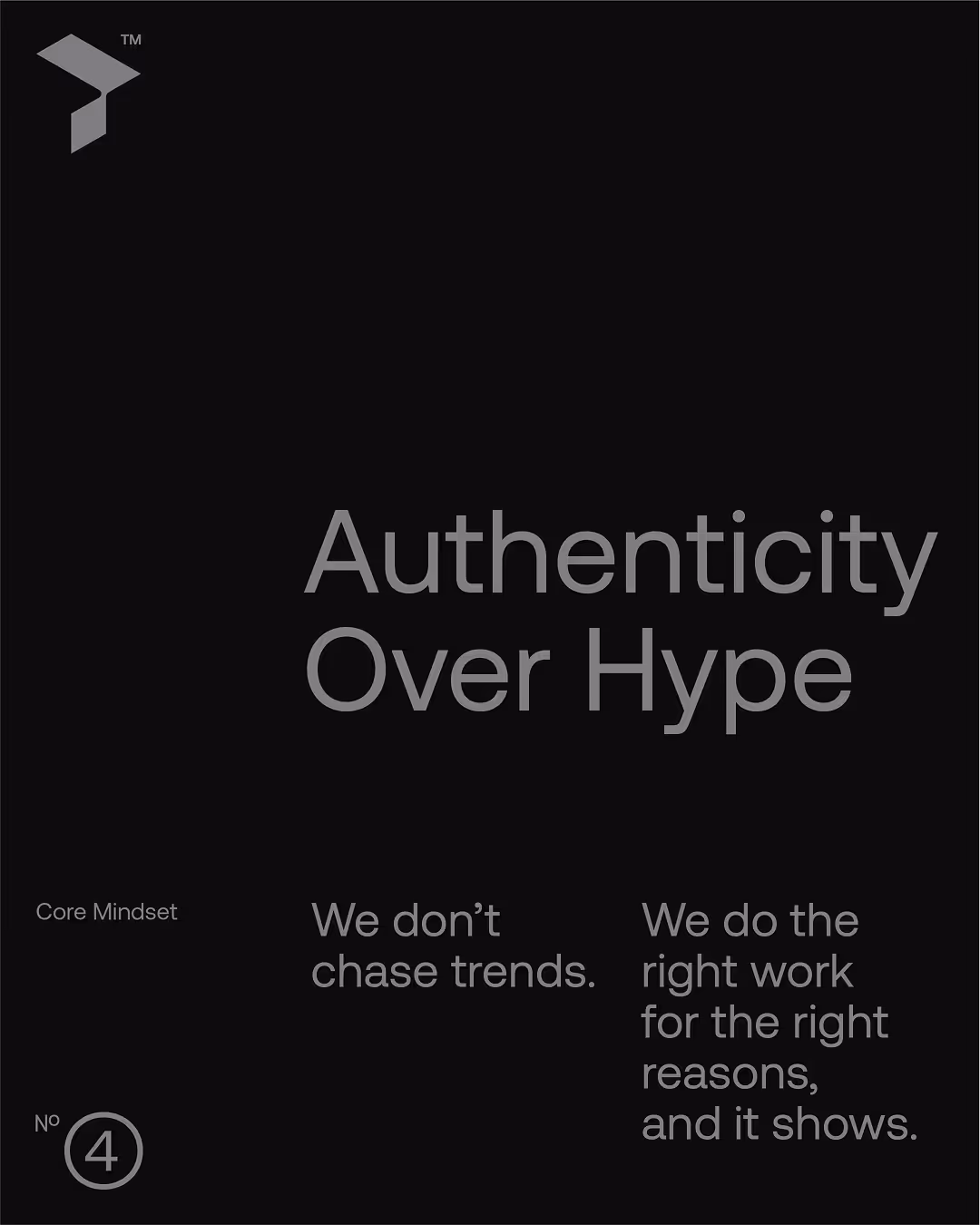
The absence of excessive decorative details and overdone effects is meant to highlight competence, stability and purposeful execution.
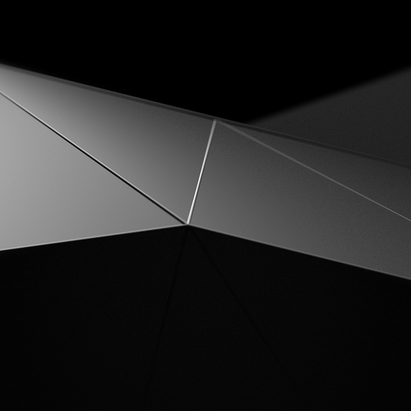

Built from modular triangles, the Trek symbol functions as an isometric solid. Once the solid loses depth and takes on a uniform color, it ceases to be a 3D object and becomes an icon that is clear, distinctive, and easy to remember. That is the point where form starts to function as a graphic sign.
Transitions between symbol forms create a base for experimentation and movement. This technique enables broad use across the system, including the creation of additional graphic elements, symbol variations, and motion design.


What our Clients feel of
This wasn't about creating a logo; it was about building the foundation for our future growth and giving us the confidence to scale.